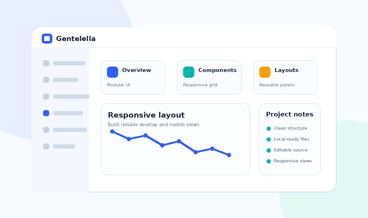
Responsive dashboard design is difficult because admin pages often contain wide tables, dense filters and navigation that assumes a large screen. A template provides a starting point, but custom components can easily reintroduce overflow and cramped interactions.
Test the real content you expect to display, then adjust layout priorities for smaller screens. Mobile users may need a different component arrangement rather than a compressed desktop dashboard.
Prioritize the main task
Reorder important content
Place the most important summary or action first when columns stack.
Reduce simultaneous controls
Move secondary filters into an expandable panel instead of forcing every control into one row.
Handle wide data components
Wrap tables intentionally
Use a labeled horizontal scroll region when all columns are essential.
Create compact alternatives
For key mobile workflows, consider card-based records that show the most important fields first.
Test interaction sizes
Navigation and buttons
Provide comfortable touch targets and clear focus states.
Long labels and errors
Test real labels, validation messages and translated text to catch hidden overflow.
Final checklist
- Confirm all local asset paths.
- Remove unused examples and dependencies.
- Test navigation, forms and tables responsively.
- Verify live hosting paths and clean URLs.
- Keep private credentials outside front-end files.