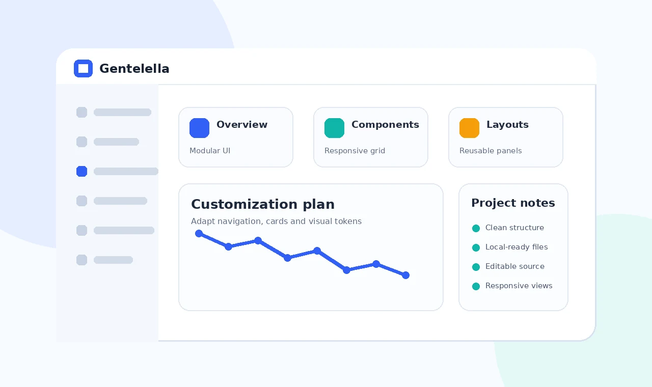
A successful Gentelella admin dashboard customization is more than replacing a logo or changing a few colors. The interface should reflect the hierarchy, tasks and terminology of the application it supports.
Begin with a small visual system, simplify the navigation and standardize recurring component states. This creates a dashboard that feels intentional while keeping the source understandable for later updates.
Define visual tokens first
Color roles
Assign clear roles for primary actions, neutral surfaces, borders, warnings and success states instead of choosing colors component by component.
Typography and spacing
Use a limited heading scale and repeatable spacing values so new pages match existing ones automatically.
Simplify navigation
Organize by user task
Group links around workflows rather than copying the example menu structure unchanged.
Control active states
Make the current page obvious and ensure collapsed mobile navigation remains keyboard accessible.
Standardize reusable components
Document variants
Define how cards, buttons, forms and alerts should appear in default, hover, focus, disabled and error states.
Remove visual noise
Keep only data and controls that help users make a decision or complete an action.
Final checklist
- Confirm all local asset paths.
- Remove unused examples and dependencies.
- Test navigation, forms and tables responsively.
- Verify live hosting paths and clean URLs.
- Keep private credentials outside front-end files.